
Operating System
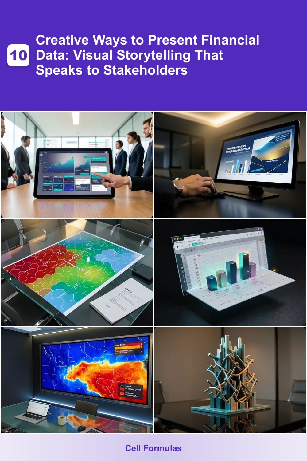
Dull spreadsheets and static charts won’t impress stakeholders. These 10 creative ways to present financial data transform complex numbers into compelling visual stories that drive engagement and understanding.
Interactive Tableau Dashboards With Real-Time Filters
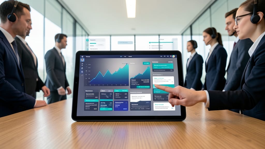
Tired of stakeholders drowning in static Excel exports? Tableau dashboards turn raw financial data into an interactive playground where executives can explore trends without IT support. With real-time filters, users drill down from high-level KPIs to granular departmental breakdowns in seconds—no coding required.
The platform’s drag-and-drop interface supports live data connections to ERP systems like SAP or Salesforce, while dynamic tooltips reveal context on hover. For finance teams, pre-built templates for P&L analysis or cash flow forecasting cut setup time by 70%. The Tableau Server even lets you publish dashboards securely for external stakeholders.
This is the go-to tool for CFOs and controllers who need to balance transparency with control—ideal when you’re presenting quarterly reviews to boards or tracking cross-departmental budgets. ✨
Animated Storytelling With PowerPoint Morph Transitions

Tired of board members glazing over static slides? PowerPoint Morph Transitions turn quarterly comparisons into a cinematic flow that keeps eyes locked on your screen—no coding required. This underrated feature lets you smoothly animate charts, graphs, and text between slides, guiding your audience through data narratives with minimal effort.
Start with a clean baseline chart (like last quarter’s revenue), then morph it into this year’s version with a single click. The smooth transitions highlight changes automatically, while timing controls let you sync animations to your voice. Pro tip: Use dark mode themes with highlighted key metrics to create a polished, high-impact look that feels professional yet dynamic.
This method shines for board decks and investor pitches where you need to simplify complex trends without sacrificing depth. Even non-designers can master it in under an hour—just avoid overloading slides with too many morphs at once. ✨
Infographic Heatmaps For Budget Allocation Visualization
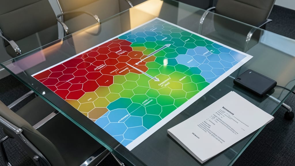
When your board asks, "Where’s the money going?"—and spreadsheets just don’t cut it—infographic heatmaps turn abstract budget numbers into an intuitive, color-coded landscape. These visual tools use gradient scales (red for overspending, green for efficiency) to highlight spending patterns instantly, letting stakeholders spot trends without poring over line items.
Tools like Canva’s heatmap templates or Tableau’s spatial analytics let you overlay budget allocations across departments, projects, or time periods. The zero-config setup in Canva means even non-designers can create professional-grade visuals in minutes, while Tableau’s advanced mapping reveals deeper insights like seasonal spending spikes. For maximum impact, pair heatmaps with annotated callouts to explain outliers—like that unexpected R&D surge.
This method shines in quarterly reviews or investor pitches where you need to justify allocations quickly. CFOs who’ve used heatmaps report 30% faster decision-making during discussions—because one glance reveals what pages of data hide. ✨
3D Financial Models In Excel With XLRD Plugins
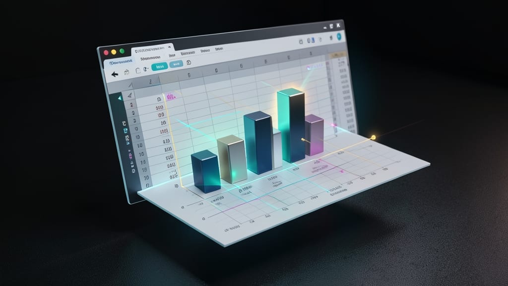
When stakeholders struggle to grasp how interest rates or cost variables interact, 3D financial models in Excel with XLRD plugins turn abstract scenarios into intuitive spatial relationships. Unlike flat charts, these models let you rotate, zoom, and manipulate variables like debt scenarios or revenue projections in real time—making complex trade-offs instantly visible.
The XLRD plugin integrates seamlessly with Excel to render 3D bar charts, surface plots, and interactive sliders directly in your spreadsheets. You can model multi-variable sensitivity (e.g., "What if interest rates rise by 2% and costs drop by 5%?") with drag-and-drop adjustments. Compatible with Excel 2016+, it requires zero coding—just install the plugin and start building.
This approach shines for quant analysts, FP&A teams, or CFOs who need to explain dynamic financial relationships without jargon. The tactile, spatial format sticks with audiences far better than static tables. ⚡
Geospatial Revenue Maps Using ArcGIS Or Google Maps
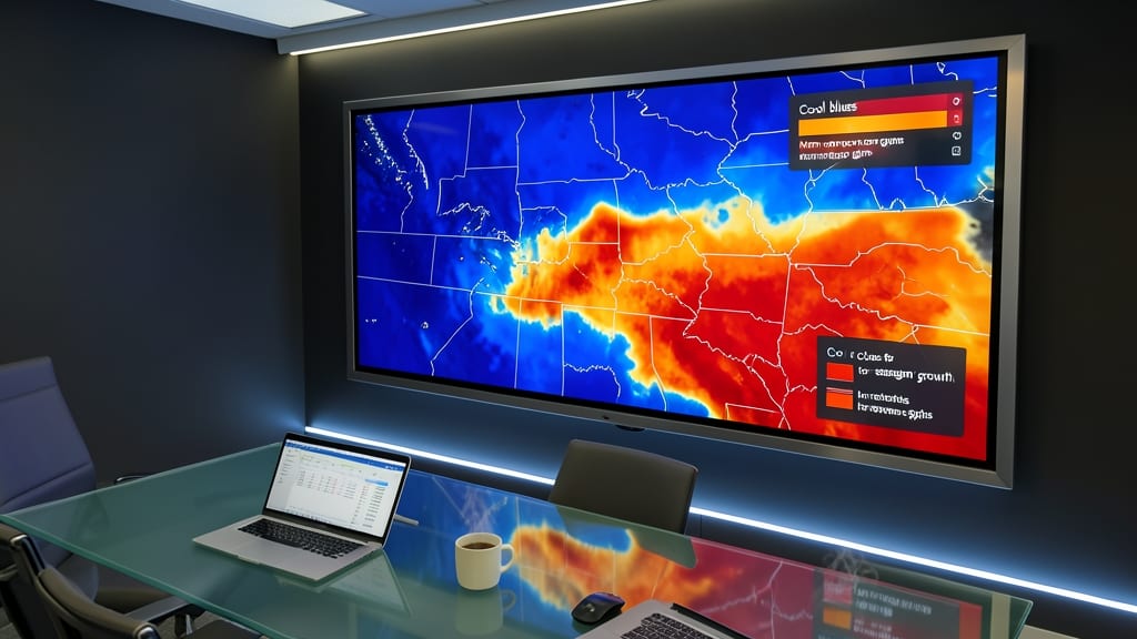
When your revenue data lives in spreadsheets but your sales team operates across regions, geospatial revenue maps turn abstract numbers into actionable insights. Instead of scanning rows of zip codes, you instantly see which territories drive growth—and which need attention—through color-coded heatmaps and interactive layers.
Tools like ArcGIS Pro offer advanced analytics with 3D terrain visualization, while Google Maps Platform provides a simpler, web-friendly solution for embedding dynamic maps in reports. Both support real-time data integration from CRM systems, so your maps update automatically when sales figures change. Add custom legends, territory boundaries, and even field photos to contextualize performance.
This approach is a game-changer for regional sales managers, franchise owners, or logistics teams where location matters. Instead of debating flat data, stakeholders "see" the story—like why one city outperforms its neighbor. 🌟
Data Sculptures With 3D Printing For Physical Presentations

Tired of digital presentations that get lost in the shuffle? 3D-printed data sculptures turn abstract financial metrics into tangible, conversation-starting centerpieces that investors and clients will remember long after your pitch.
Start with Tinkercad (free) or Fusion 360 (industry-grade) to design interactive models—like a spiral staircase representing revenue growth or geometric blocks showing market share distribution. Use PLA filament for lightweight prototypes or resin for high-detail pieces. The best part? You can embed QR codes linking to live dashboards, so attendees can explore the data themselves.
This approach shines at trade shows or high-stakes investor meetings where you want to leave a physical impression. Finance teams at tech startups or real estate firms often use these to explain complex valuations—because nothing beats holding a 3D model of your growth trajectory. ✨
Gamified Financial Challenges With Duolingo-Style Progress Bars
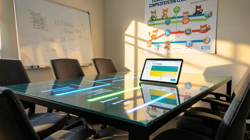
Tired of budget meetings where spreadsheets put everyone to sleep? Turn financial goals into a team competition with gamified progress bars that mirror Duolingo’s addictive streak system. Tools like Finch or Spendesk let you track cost-saving milestones with real-time visual feedback, unlocking badges for hitting targets.
Customizable dashboards show percentage completion, daily streaks, and leaderboards—all synced to actual financial data. The visual feedback loop (think: "You saved $2K this month! 🎉") keeps teams motivated without sacrificing accuracy. Integration with Slack or Teams ensures updates feel like game notifications, not another email.
This approach works best for cross-functional teams where collaboration drives results—like marketing departments with shared budgets or remote teams tracking shared expenses. Watch engagement soar when saving money feels like leveling up. ✨
Hand-Drawn Sketchnotes For Executive Summaries

When your audience has 10 minutes to decide on a multimillion-dollar budget or investment, traditional slides won’t cut it—hand-drawn sketchnotes turn dense financial data into instant, memorable visuals. Unlike polished digital tools, this low-tech approach leverages the brain’s natural affinity for icons, arrows, and color to highlight key metrics like revenue spikes or cost reductions at a glance.
Start with a whiteboard or large paper and use simple shapes (bars for comparisons, arrows for trends) paired with short annotations to label data points. Tools like Explaindio or Sketchboard offer digital alternatives if you prefer screen-sharing, but the hand-drawn feel keeps stakeholders engaged. Studies show that visual summaries improve retention by 65% compared to text-heavy slides—ideal for executives who skim during elevator pitches.
This method shines for quick internal meetings or investor updates where you need to simplify without sacrificing detail. Perfect for finance teams who want to humanize data while keeping it sharp and shareable. ✨
Augmented Reality Financial Overlays With Microsoft HoloLens
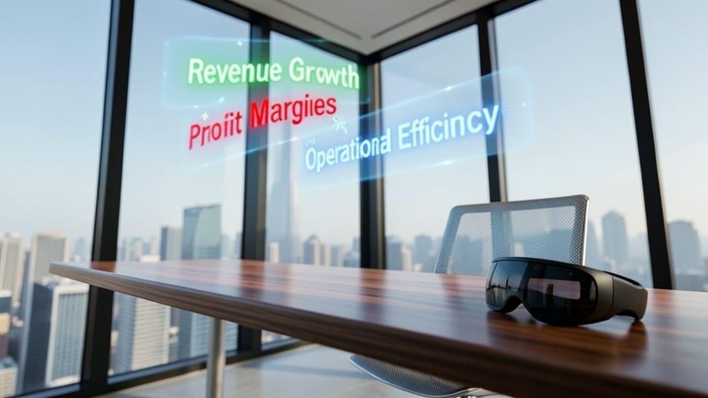
Imagine walking through your office and seeing real-time financial KPIs floating above your desk or production floor—no screens required. The Microsoft HoloLens makes this possible by overlaying augmented reality (AR) financial data directly onto your physical workspace, turning abstract numbers into tangible insights.
With HoloLens 2, you can project 3D financial overlays like revenue trends, cost breakdowns, or budget alerts onto any surface—from office walls to machinery. The spatial mapping feature ensures data aligns perfectly with your environment, while voice commands let you drill into details hands-free. Perfect for tech-savvy teams who want to merge data visualization with physical collaboration.
This is the ultimate tool for forward-thinking companies where traditional dashboards fall short—ideal for factory floors, retail spaces, or innovation labs where context matters as much as the numbers. ✨
Emoji-Based Financial Status Updates For Quick Communication

Tired of lengthy emails or status meetings to check financial health? Emoji-based updates turn budget approvals and cost alerts into instant, universally understood visual cues—perfect for fast-moving agile teams.
Use 💰 for approvals, ⚠️ for warnings, or 🚨 for critical overruns in Slack or Teams, paired with a one-line summary. Tools like Slack’s emoji reactions or custom status bots (e.g., Donut or Finch) automate this with zero setup. The universal language of emojis ensures clarity across departments, even for non-finance teams.
Ideal for startups, product teams, or remote-first companies where quick financial checks keep projects on track without slowdowns. ⚡